Contests - How are entries organized and resized in the tiled gallery layout? Follow
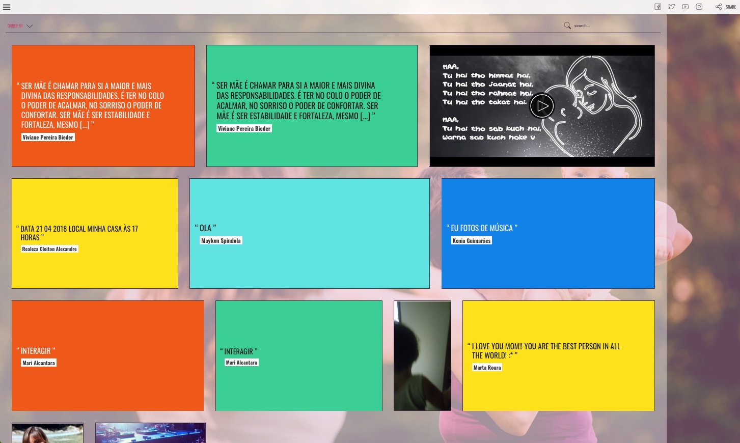
In all contests created with Easypromos - text, photo and video contests - administrators can enable the tiled gallery layout, in order to organize the entries in the contest gallery. With the aim of optimizing the space available, the tiled gallery layout displays the different elements (texts, photos and videos) in rows, fitting them into the available space as if they were bricks in a wall. You can see an example of this layout in the following image:
The tiled gallery layout is only available in Easypromos Premium and White Label versions.
In order to enable the tiled gallery layout you can follow these steps:
1. Go to Pages > Gallery, and click the 'Publish page' button:
2. Next, go to Pages > Gallery > Layout page and choose the 'Tiled gallery' option:
3. When enabling the tiled gallery layout, two new options will be displayed:
- Maximum height of rows: it allows to specify the maximum height in pixels of the different elements within the tiled gallery. The value by default is 300px.
- Color configuration for quotes: In text-based contests, users' entries will be displayed within the tiled gallery as quotes inside a colored box. This box can be customized with a background color and font color.
User requirements to upload the pictures
User requirements to upload photos are the same as with the classic layout:
- Picture valid formats: JPG/GIF/PNG
- Picture maximum size: 10MB
- Dimensions: without restrictions
The application will automatically resize the pictures uploaded by the users for the correct visualization within the picture gallery.
Features of the tiled gallery layout
When the tiled gallery layout is enabled, this will be the default layout used to display the pictures in the gallery when users access the contest gallery.
Important note: The tiled gallery layout is 100% responsive, but in case of a device with a minimum screen resolution of 550px width, the classic layout will be directly used, since this layout offers the best user experience in low resolution screens, thus optimizing usability.
When hovering the cursor over the entry, the basic information related to the entry appears: user name, date, photo or video description if it exists, the possibility to vote and share the entry. Note: This information can change depending on the entry width within the gallery. For more information, check the last part of this article, the section ‘Maximum height option’.
When clicking on the entry, the viewer will be displayed, which enables the entry to be seen individually and enlarged, with the user information, description, and the actions over the entry: share, vote and comment.
Additionally, the viewer system enables the users to navigate between the different elements using the arrows or directly using the computer keyboard with ‘next’ and ‘previous’ buttons.
How elements are displayed in the gallery
Number of elements and pagination
The different elements are displayed in the gallery with pagination. From the promotion edit form administrators can select the number of entries that will be displayed per page in the gallery. The number of elements that can be displayed can be from 5 to a maximum of 200.
The value by default is 25 entries per page.
Order of the entries
By default entries are ordered from most to least recent. From the promotion edit form, there is the possibility to order the entries at random, so that every time the gallery is loaded the entries will be displayed in a new order.
In case voting is enabled, a new option will be available in the gallery that will allow users to order the entries from more to less voted.
Anonymous entries
There is the possibility to hide the author of the entries. To do so, the option ‘Anonymous entries’ from the promotion edit form needs to be enabled.
This option can be controlled from the promotion edit form, under the section Gallery > Options:
Entries layout
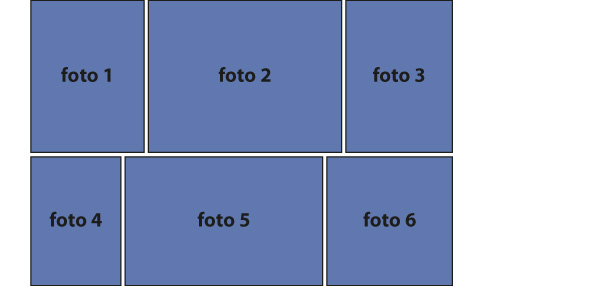
Tiled gallery layout fits all the entries of the contest into the available space as if they were bricks in a wall. This method of organizing them allows the gallery to change its appearance depending on the number of entries, since each new entry affects the distribution of the rest of the entries in the gallery.
Regarding the setting up of this layout the only requirement is the maximum height of the rows, which has a direct effect on the number of entries that will be included in each row.
Below we explain what is the tiled gallery layout like in a photo contest:
1. The pictures are displayed in the gallery by rows. Each row of the gallery will use all the available width. This width will depend on the screen resolution, with a maximum of 810px. Before starting to display the photos, the application will prepare each row. For each row, all the available width will be used, and 50px will be added as a threshold:

2. In an organized manner, the pictures adjusted to the maximum height value are added to the first row, until the next image exceeds the total width (including row threshold of 50px):

3. In the example below images 1, 2 and 3 can be placed in the first row, but image 4 exceeds the threshold. Once the row is completed, the images are scaled so that their width coincides with the gallery width (without the threshold):

4. The same process is followed for each row until completing all the images to display in the gallery:

Note: Since the gallery works with the pagination system, it can happen that in the last row of the page there aren’t enough photos to complete the available width.
Maximum height option
As we can see in the previous schema, the maximum height option available from the promotion edit form allows to control the dimensions of the photos within the gallery. This way, when defining a high value for this option, the photos will be displayed in a bigger size, but there will be fewer pictures per row. On the contrary, when defining a low height value, the photos will be displayed in a smaller size, but there will be more pictures per row.
The recommended values for the maximum height option are between 200px and 400px, and the default value when the gallery is activated is 300px.
From a maximum height value less than 300px on, vertical images can be too small to show all the information displayed when users place the mouse over the picture. Therefore, some of these elements will be hidden depending on the scale applied to the image width:
- Images wider than 200 pixels: all the information is displayed.
- Less than 200 pixels: the icon to enlarge the image is hidden (although this action can be performed by clicking on the image).
- Less than 180 pixels: the comment of the entrant is hidden, if it exists.
- Less than 150 pixels: the button to share, the name of the entrant and the date of registration is hidden.
- Less than 120 pixels: the button to vote is hidden.
- Less than 50 pixels: the user avatar is hidden.


Comments
0 comments
Please sign in to leave a comment.